App Redesign
App Redesign
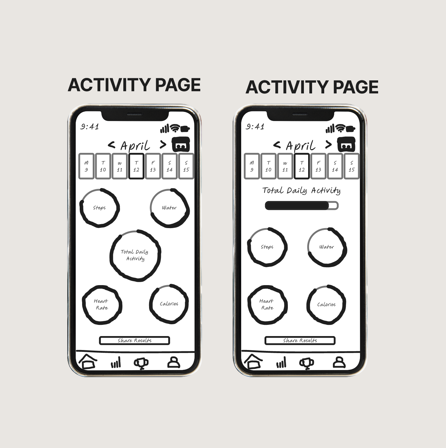
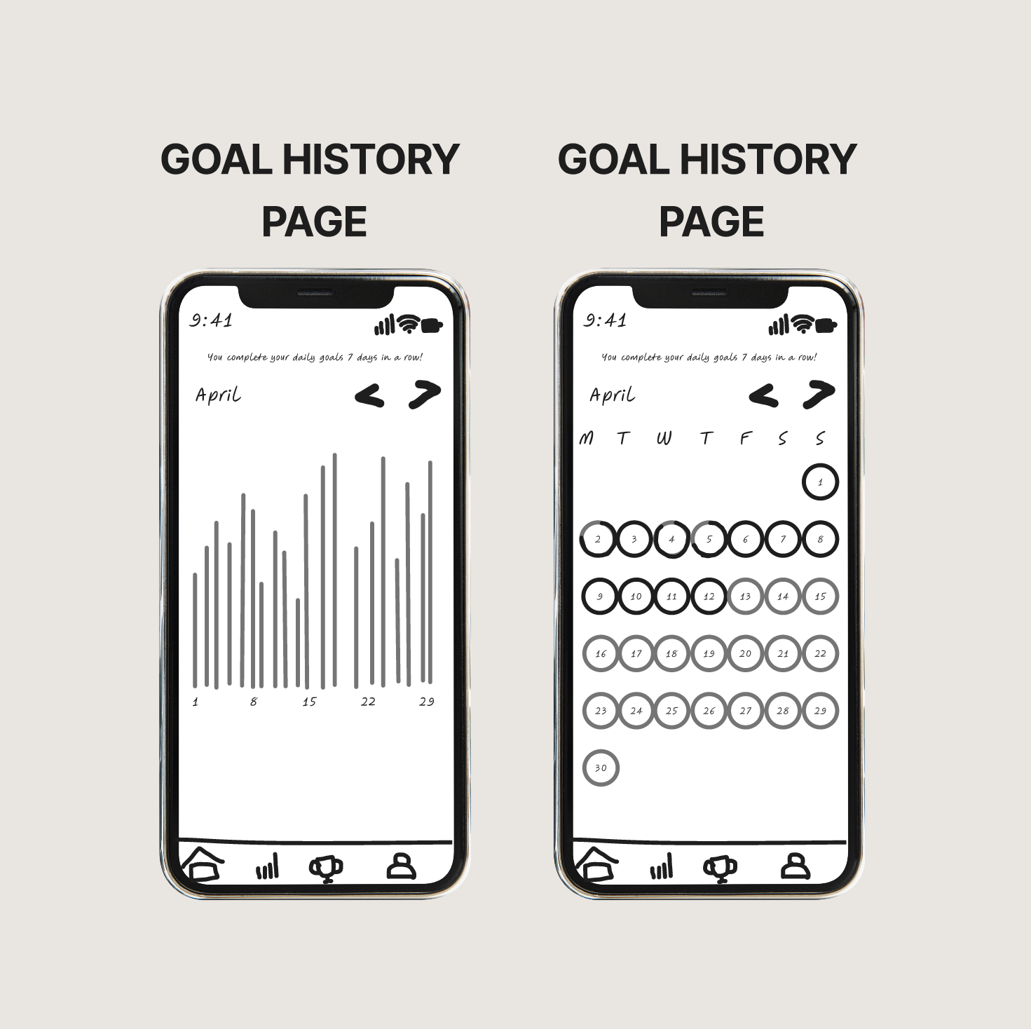
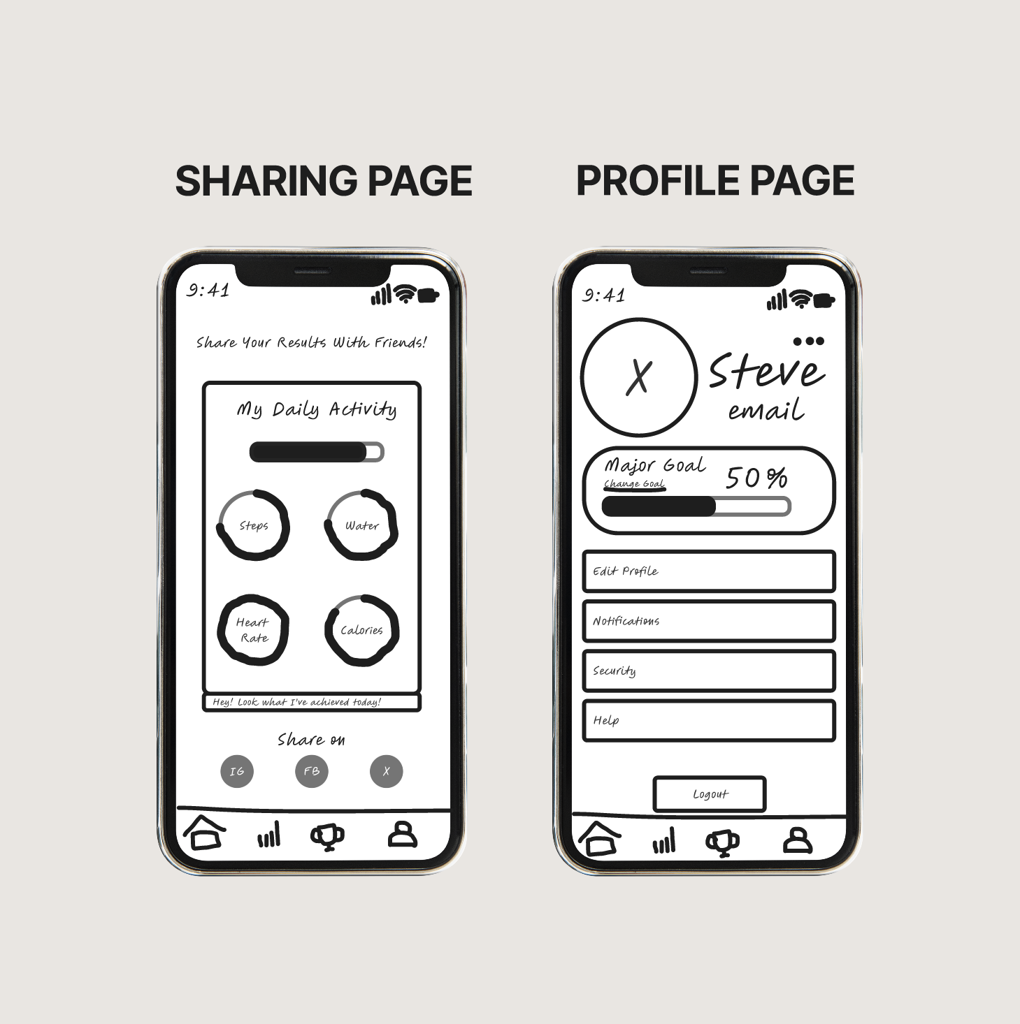
Lo-Fi Wireframes
Lo-Fi Wireframes
User Persona
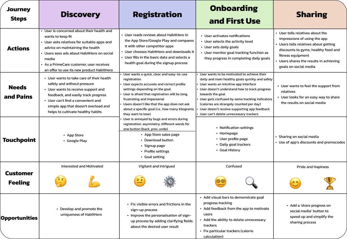
User Journey

Big-Picture Storyboard
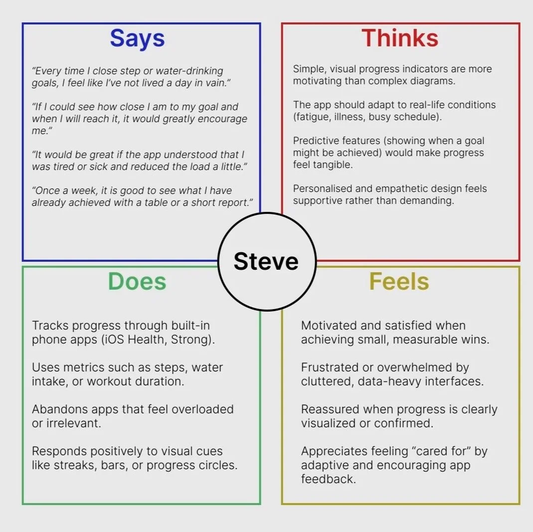
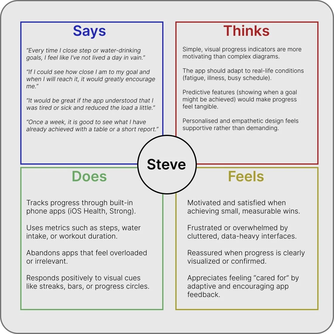
Empathy Map

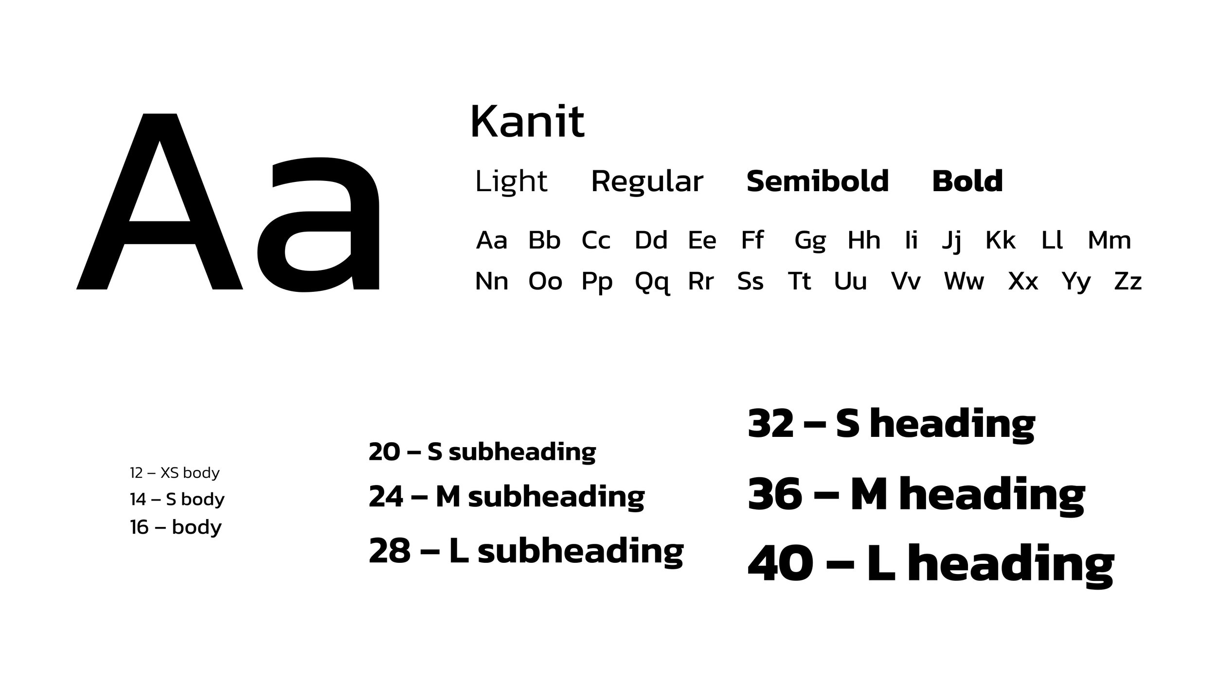
Style Guide
HabitHero • Educational Project
Overview
HabitHero is a health and wellness app that motivates users to build healthier habits through personalised activity goals and rewards. By completing health assessments, physical exercises, and healthy eating, users earn points that bring them closer to their wellness goals. The points earned can then be redeemed for rewards such as discounts on gym memberships, healthy food items, or fitness equipment.
My Role
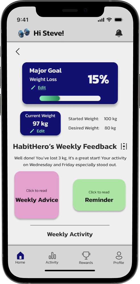
I have analysed the existing MVP and identified major usability issues based on the provided app map. Then I redesigned the interface to better align with user expectations, focusing on clarity, accessibility, and motivation. To validate these improvements, I conducted user research with three participants, gathering feedback to refine the overall user experience.
Current Problem Statement
‘Users of HabitHero struggle to effectively track and measure progress towards their goals, leading to a lack of motivation and difficulty in achieving desired outcomes. The current version of HabitHero fails to adequately provide users with the tools and feedback necessary to accurately monitor their progress towards their goals, resulting in frustration and disengagement.’
Assumption Analysis
Knowns
Users have difficulty tracking progress, which reduces their motivation.
Users can’t monitor how close they are to the desired goal.
Users lack automatic feedback regarding their progress which leads to frustration.
In the current version of the app, it is impossible to view the dynamics in the past or forecast future results.
Users want adjustable goals.
Unknowns
What types of progress visualisation are the most convincing and motivating for users?
How often do users actually check or update their progress in the app?
How often do users want to receive feedback: daily or weekly?
At what point exactly and why do users stop using the app?
Are there any other parameters by which users would like to track their
progress (besides calories, steps, heartbeat, and distance)?
Assumptions
Users want to see visual indicators (graphs, runtimes, bars) for tracking progress, which will increase their motivation.
Users are willing to share personal data (e.g., current weight) since it helps to improve tracking personalisation.
Users are interested in personalised goal predictions based on their past behaviour.
Users leave the app because they don't get enough feedback so that progress feels invisible and imperceptible.
Implementing adaptive daily goals will increase users' motivation and achievability.
Hypotheses
Research
To understand how users generate and maintain motivation to achieve goals related to health and well-being.
To identify which factors contribute to or hinder the regular use of health and habit-related apps.
Goals
What approaches and strategies do users use to maintain health-related habits?
How do users perceive progress and how do they prefer to track it?
What helps or prevents users from maintaining interest in digital health tracking tools in the long term?
Questions
3 in-person interviews with participants from diverse backgrounds (student, IT specialist, accountant)
Throughout the process, I adhered to DEI principles and included participants with various backgrounds to make the product accessible to a wide audience. During analysis, I considered variations in participants’ experiences to identify the distinct needs of different user groups.
Key Insights
Users need simple, clear, and intuitive progress visualisation.
1
Regular, concise, and positive feedback sustains engagement.
2
Flexibility and empathy increase trust and motivation.
3
Transparency about data use builds user confidence.
4
Aggregated Empathy Map
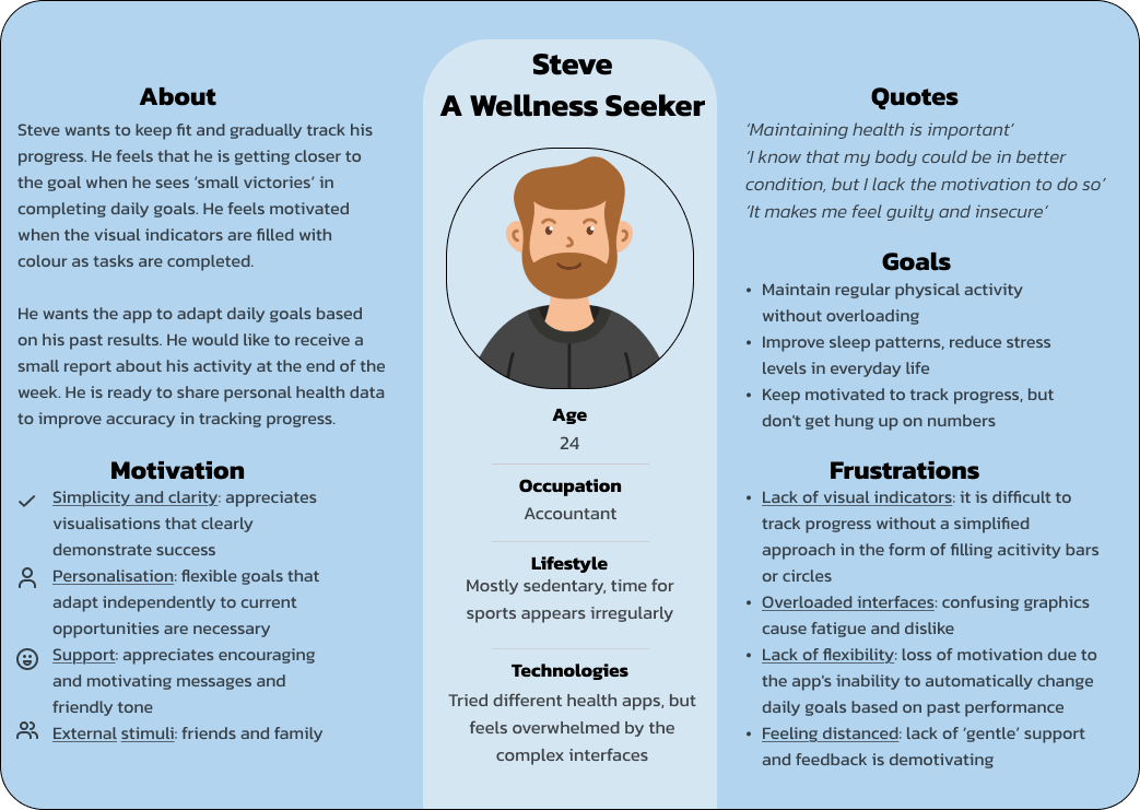
User Persona
User Journey
Affinity Map
Motivation
Functionality
C: ‘I’d enter my current weight if it really helps to track progress. The main thing is to understand why it is needed and how it is used’.
B: ‘It would be great if the app understood that I was tired or sick, and reduced the load a little, rather than making me feel guilty and insecure’.
B: ‘When I see on the scales that the weight is reduced by at least a couple of grams, it gives me confidence that I am moving in the right direction’.
B: ‘I like diagrams, but when they are too overloaded, I get lost... Sometimes I just want to see a coloured bar to know if I’m on the right track’.
B: ‘If I could see how close I am to my goal and when I will reach it, it would greatly encourage me’.
Progress
C: ‘Once a week, it is good to see what I have already achieved with a table or a short report’.
Feedback
B: ‘When the app can notify users like “You’re already 80% of the way”, it may encourage them to continue progress’.
A: ‘Every time I close step or water-drinking goals, I feel like I've not lived a day in vain’.
A: ‘I'd like to receive a short visually appealing report once a week, just to see how I'm doing’.
A: ‘Even a simple visual confirmation motivates me, for example, a streak, like in Duolingo, or a regular check mark’.
HMW Questions
Revised Problem Statement
‘Users of HabitHero struggle to stay motivated and consistent because the app’s current design lacks clear progress visualization, adaptive goal-setting, and meaningful feedback. Without simple, transparent, and empathetic tracking features, users find it difficult to understand their achievements, trust the app’s recommendations, and remain engaged in their wellness journey’.
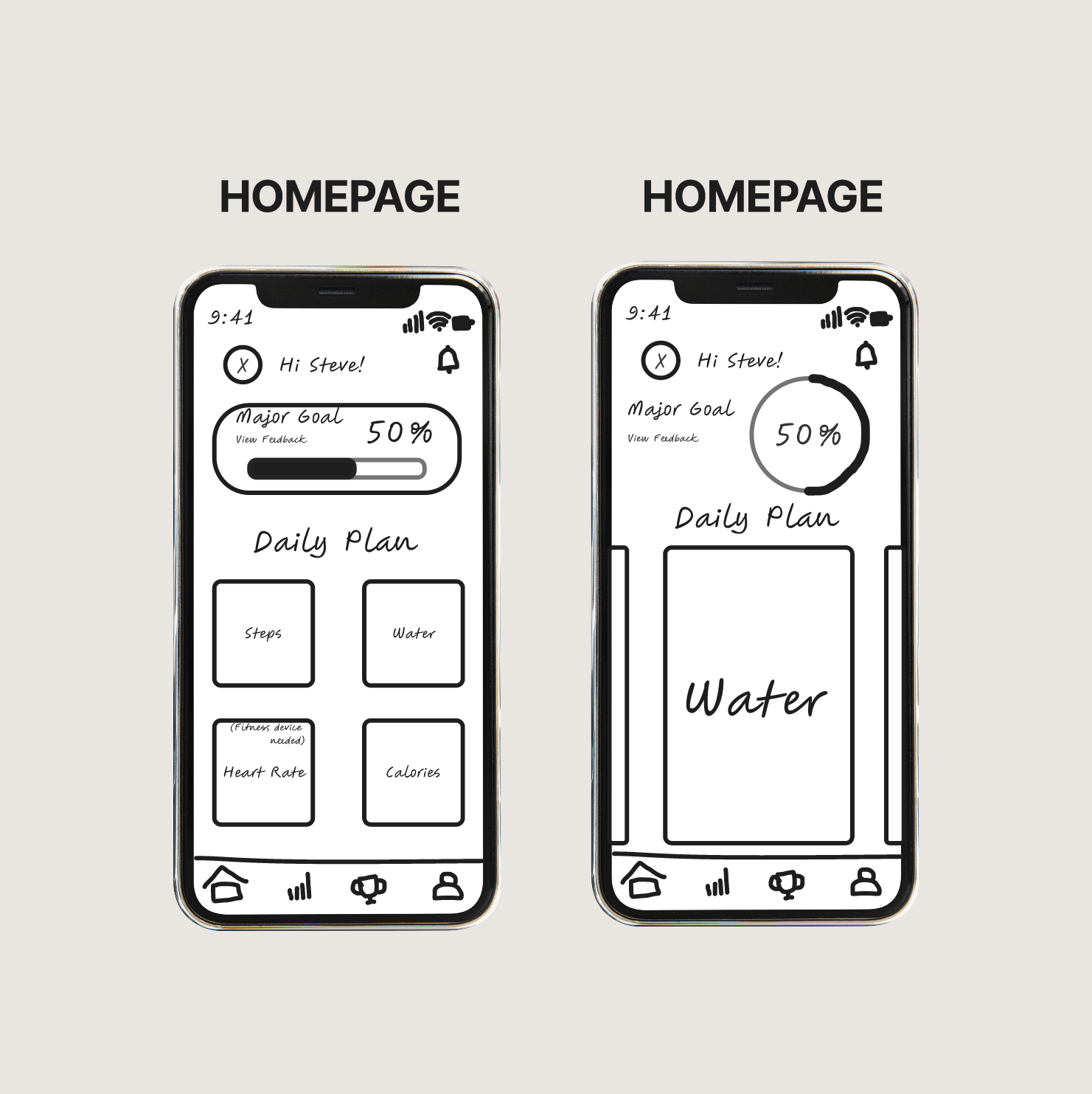
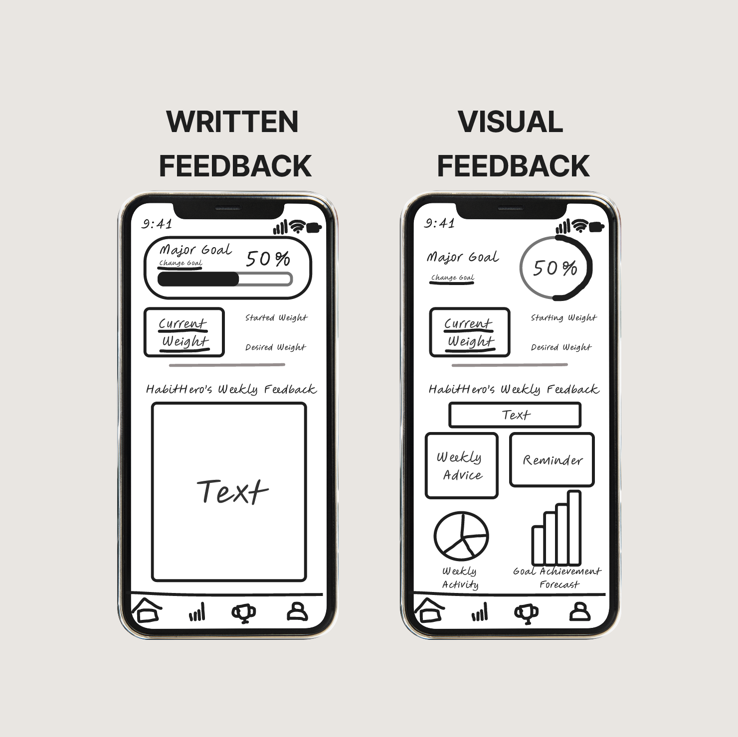
Low-Fidelity Wireframes • Click here to view the full version
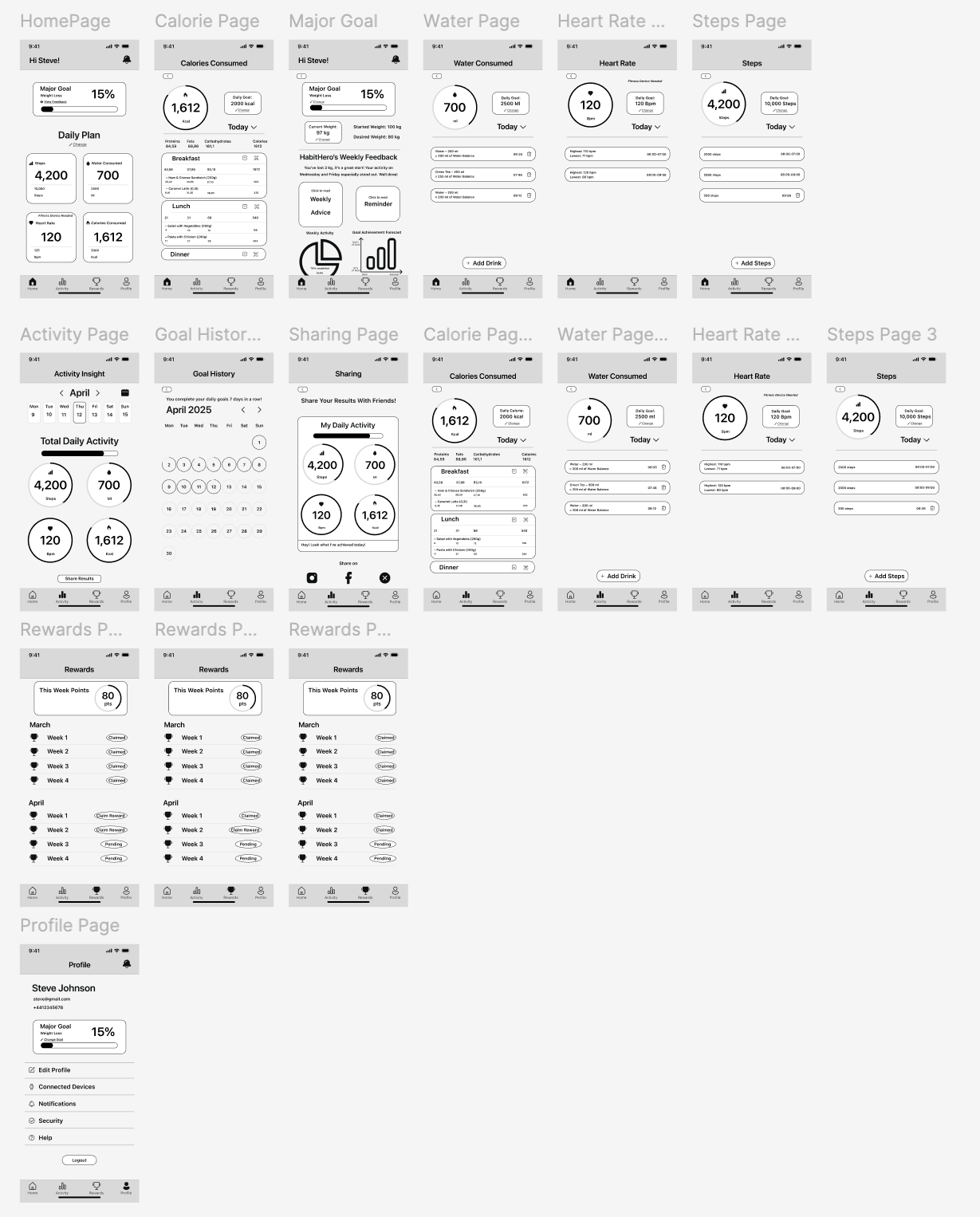
Mid-Fidelity Wireframes • Click here to view the full version
Usability Testing
3 moderated in-person sessions
Goal
To evaluate the usability and intuitiveness of the new HabitHero interface after adding several features.
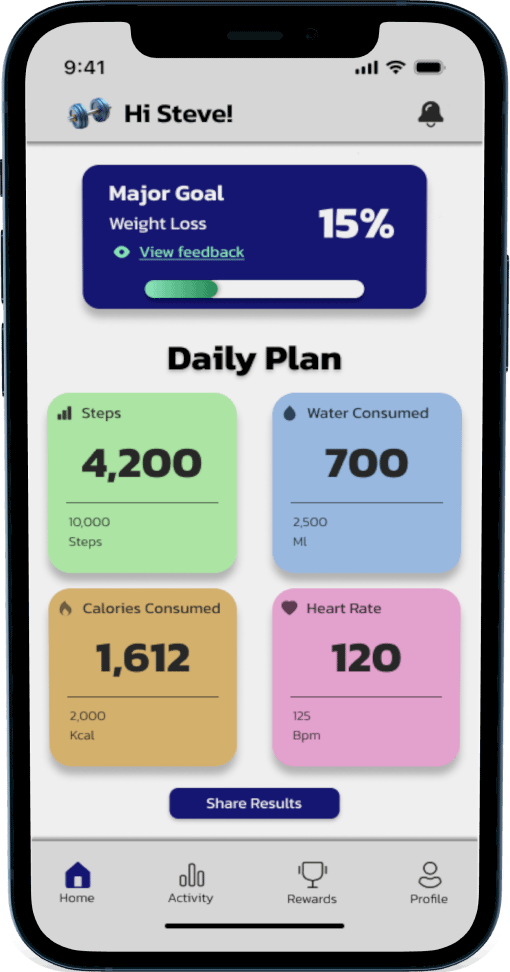
How easy is it for users to navigate the updated homepage?
Do users understand how to edit or add daily goals (steps, water, food)?
Can users quickly find the monthly goal completion history?
Is it easy for users to share the results with friends via social media?
Questions
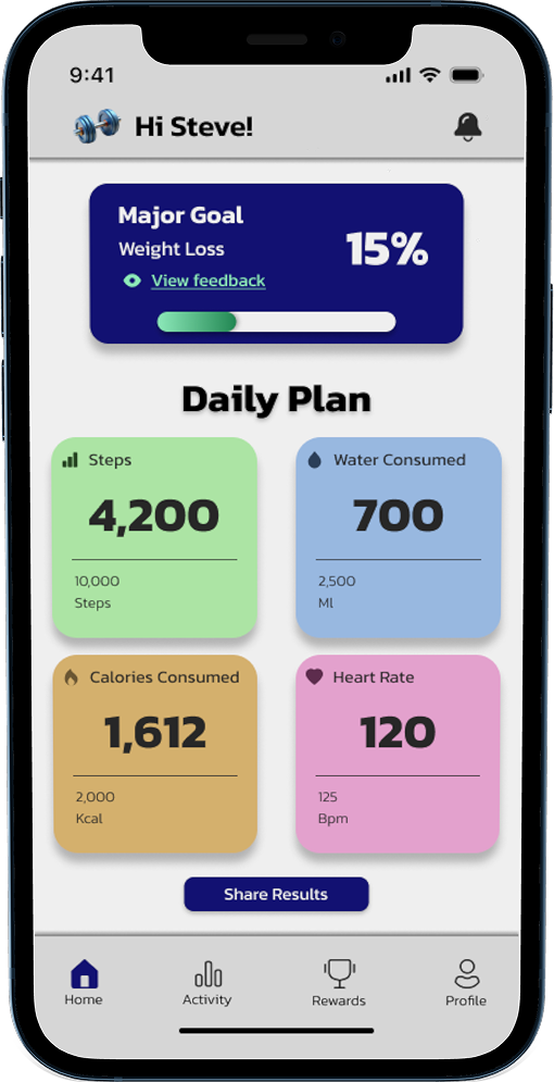
Participants confused the “Add steps/drink” button with the “Edit daily goal” option, as its lower placement and lack of color emphasis made it less distinguishable. This high-severity issue increased cognitive load and slowed task completion.
Key Findings
A medium-severity issue identified was the small font size in certain labels and trackers, which reduced readability and caused users to strain their eyes, especially in the calorie tracker.
A low-severity issue emerged around the Goal History button, as several users found the calendar icon misleading. They expected it to open a calendar rather than display activity history.
Move the “Edit daily goal” button to the profile settings, leaving only one clear call-to-action (“Add steps/drink”) on the main screen to simplify the interface and reduce user confusion
Recommendations
Increase the font size for key metrics and add scrolling functionality in text-heavy sections to enhance comfort and reduce visual fatigue
Change the icon to a more intuitive one and add a text label to make activity tracking clearer and easier
